
Running a successful website is no small feat. It requires a great deal of hard work, dedication, and knowledge from a team of experts all working symbiotically toward a common goal. There are so many different aspects to consider — from designing the perfect user experience to maintaining an effective web hosting infrastructure.
But one of the most critical aspects that can make or break success is the conversion rate of your forms. Your form conversion rate is the percentage of visitors who successfully complete a form on your website. The higher this rate, the more successful your site will be at generating new leads, sales, and other desired outcomes.
Whether it’s a contact form, a sign-up form, or a checkout form, the ease and convenience of these for users directly impact business.
That’s why, today, we’ll explore 25 ways to increase your online form conversion rates and, in turn, boost the effectiveness of your website.
1. Keep forms short and simple
The first rule of thumb, when it comes to increasing your form conversion rate, is to keep your forms short and simple. The less time and effort it takes for a user to complete a form, the more likely they are to do so.
According to the Contentsquare 2023 Digital Experience Benchmark report, the average internet user spends less than 5.6 minutes on a website they’re actively engaged with. Think reading a blog post or trying to make a purchase.
At first glance, that seems like a decent amount of time, but when you consider session duration has decreased by 7.5% since 2021, it’s clear that user behavior indicates less patience.
And that’s not a lot of time to capture their attention and get them to fill out a form. By keeping your forms short and straightforward, you’re making it as easy as possible for users to engage with your site and, ultimately, convert.
Consider only asking for the most essential information. If you’re collecting leads from potential event sponsors, you really only need the representative’s name and email. Your sales team may also want you to ask for a phone number, company name, and budget information, but each of these questions will reduce the number of top-of-funnel submissions you receive. So, you’ll have to consider this balance and optimize your forms accordingly.
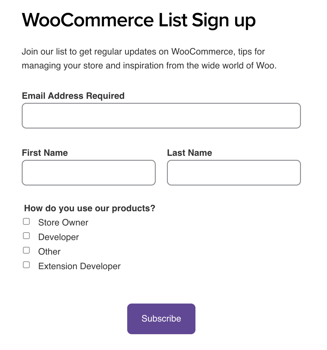
2. Place your forms above the fold
“Above the fold” is a term borrowed from the newspaper industry that refers to the upper half of the front page. The term “above the fold” in web design is the part of a webpage that’s visible without the need to scroll. Placing your lead generation forms above the fold on their landing page makes them immediately visible to visitors, increasing the likelihood that they’ll be filled out.
A study by Nielsen Norman Group found that user attention drops dramatically below the fold. By placing your form above, you’re ensuring that it’s one of the first things a user sees when they land on your page.
The goal is to make it as easy as possible for people to convert. By strategically placing your web forms, you’re removing one more barrier between the user and a conversion.
3. Limit the use of CAPTCHAs
CAPTCHAs, those little tests that ask you to identify traffic lights or crosswalks in a series of images, are a common method of preventing form spam. However, they can also be a significant barrier to web form completion.
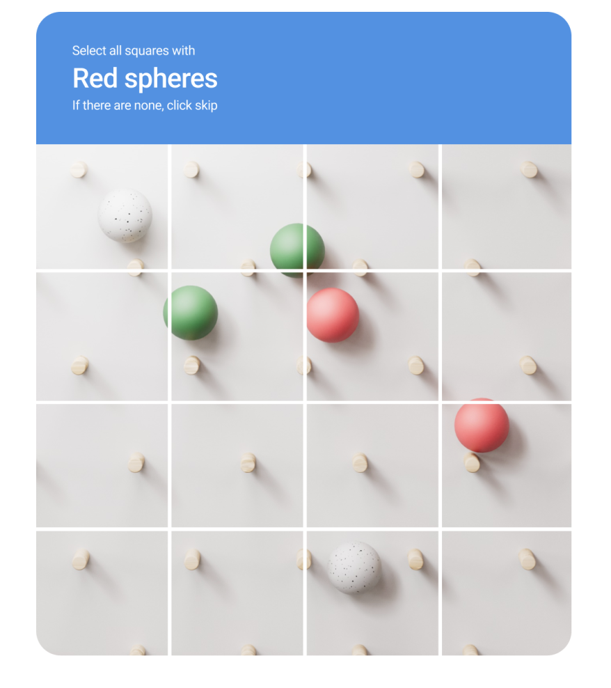
CAPTCHAs can be frustrating and time-consuming for users, especially if they’re difficult to solve. And they can also pose accessibility issues for those with impairments. While CAPTCHAs can be effective at preventing bots from submitting forms, they can also deter legitimate users.
Instead of relying on CAPTCHAs, consider other methods of spam prevention that are less intrusive and more user-friendly…
4. Use non-intrusive spam protection
Non-intrusive spam protection methods can be a great alternative to CAPTCHAs. These methods work behind the scenes to prevent spam without disrupting the user’s experience.
For example, the Akismet anti-spam plugin for WordPress sites offers powerful spam protection without the need for CAPTCHAs. It automatically checks and filters out spam submissions, allowing you to focus on managing your site.

Through prioritizing non-intrusive spam protection methods, you can improve the user experience and accessibility of your forms, leading to higher conversion rates.
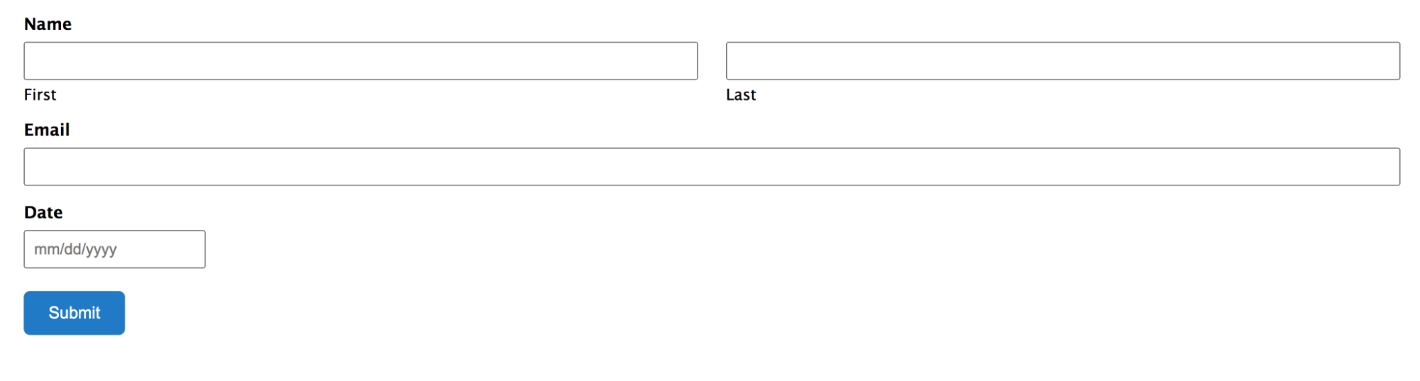
5. Group related fields together
Organization is key when it comes to designing user-friendly forms. Grouping related fields together can make your forms easier to navigate and understand, leading to higher completion rates.
You might wish to group contact information fields (like name, email, and phone number) together, separate from billing information fields (like credit card number, expiration date, and CVV).
This not only makes your form more visually organized, but it also helps users understand what kind of information is expected in each section.
6. Use clear and descriptive field labels
Clear and descriptive field labels are crucial for ensuring that people know exactly what information they need to provide. Ambiguous or confusing labels can lead to errors, frustration, and ultimately, form abandonment.
For instance, if you’re asking for a user’s phone number, specify whether it’s a home, work, or mobile number.
If you’re asking for a date, indicate the format you want it in (e.g., MM/DD/YYYY).
The goal is to make it as easy as possible for users to complete your form. Clear, descriptive labels go a long way towards achieving this and improving your form conversions.
7. Optimize for mobile devices
With more than half of all web traffic now coming from mobile devices, it’s more important than ever to ensure your forms are mobile-friendly.
This means performing a series of form optimization tasks, including:
- Making sure your web forms are fully responsive and easy to navigate on smaller screens
- Ensuring fields are large enough to tap
- Making it easy for users to switch between fields
- Avoiding the use of elements that don’t work well on mobile, like hover tooltips.
Mobile users are on the go, so they are even less patient than desktop users. By optimizing your forms for mobile, you can make it easier for users to convert and boost your conversion rate.
8. Use progress indicators
If your form is long or divided into multiple sections, using progress indicators can be a great way to keep site visitors engaged. Progress indicators show people how far they’ve come and how much further they have to go to complete the form.

This can be particularly useful for complex forms, like multistep checkout processes or lengthy surveys. When you show users their progress, you’re giving them a sense of accomplishment and encouraging them to go all the way.
9. Use autofill and auto-suggest features
Autofill and auto-suggest features can significantly speed up the form completion process and improve the user experience. These features automatically populate fields with relevant information, saving users time and effort.
For example, an autofill feature might populate a user’s address based on their IP location, while an auto-suggest feature might suggest relevant options as someone begins typing into a field.
When you reduce the amount of typing and decision-making required, these features can make your forms quicker and easier to complete, leading to higher conversion rates.
10. Use inline validation
Inline validation involves checking each field for errors as the user fills out the form, rather than waiting until they hit the “submit” button. If a user makes a mistake, they’re immediately alerted and can correct the error on the spot.
This can prevent frustration and confusion that can occur when a user completes a form, only to be told they’ve made multiple errors. It also helps users learn as they go, improving the overall experience.
11. Use conditional logic
Conditional logic, also known as “if-this-then-that” logic, can make your forms more interactive and user-friendly. It involves showing or hiding fields based on the user’s previous responses.
So, if someone indicates that they’re from the United States, you might show a field asking for their state. If they indicate they’re from another country, that field would be hidden.
By tailoring your form to each user’s responses, you can make the form-filling process more relevant and less overwhelming, leading to higher conversion rates.
12. Limit the use of mandatory fields
While it’s important to gather as much relevant information as possible, too many form fields can deter people from completing your form. Try to make fewer form fields mandatory and only require the most essential information.
If a field isn’t absolutely necessary, consider making it optional. Users who are in a hurry or who value their privacy will appreciate the option to skip non-essential fields.
13. Use smart defaults
Smart defaults involve pre-populating form fields with the most likely response. This can save users time and effort, making your form quicker and easier to complete.
For example, if most of your site visitors are from the United States, you might set “United States” as the default option in the “Country” field. Users from other countries can still select their country from the dropdown menu, but U.S. users won’t have to.
14. Break long forms into multiple pages
Long forms can be overwhelming and may deter users from starting. By breaking these forms into smaller, more manageable steps, you can make the form-filling process less daunting and more user-friendly.
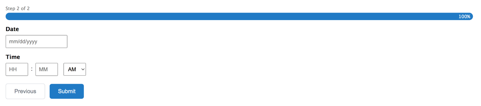
Multipage forms also give users a sense of progress, which can motivate them to complete the form. Just remember to include a progress indicator, as we already mentioned, so users know how far they’ve come and how much further they have to go.
15. Ensure accessibility for all users
Accessibility should be a priority when designing your forms. This means ensuring that all users, including those with impairments or disabilities, can easily navigate and complete your web forms.
This might involve using larger text sizes, providing alternative text for images, and ensuring your forms are compatible with screen readers. The Web Content Accessibility Guidelines (WCAG) offers all the details about making web content more accessible.
By making your forms accessible, you’re not only complying with legal requirements and ethical best practices, but you’re also expanding your user base and increasing your potential conversion rates.
16. Use contrasting colors and clear typography
The design of your forms can have a significant impact on their usability and, consequently, your conversion rates. Using contrasting colors can make your forms more visually appealing and easier to read.
Similarly, clear typography can improve readability and reduce the likelihood of errors. Choose fonts that are easy to read and large enough to be seen on all devices.
17. Eliminate unnecessary distractions
When a user is filling out a form, you want their focus to be on the form and nothing else. This means eliminating any unnecessary distractions, like pop-ups, excessive text, or irrelevant images.
The simpler and more focused your form page is, the more likely people are to complete the form. Remember, the goal is to make it as easy as possible for users to convert.
18. Display trust signals and social proof
Trust signals and social proof can significantly increase your form conversion rates by building trust with your potential customers and site visitors. This might involve displaying security badges, testimonials, or the number of satisfied customers you have.
For example, if you’re asking for sensitive information like credit card details, displaying a security badge can reassure users that their information will be safe.
Similarly, testimonials can show people that others have had positive experiences with your company.
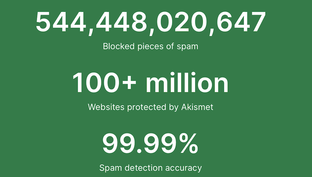
On the Akismet homepage, there’s a prominent display of how many pieces of spam have been blocked, how many websites have been protected, and the spam detection accuracy.
19. Clearly state your privacy policy
In an era where data privacy is a major concern, you need to clearly state your privacy policy on your forms. Let visitors know exactly how their information will be used and stored. This transparency can build trust and increase the likelihood of people completing your form.
Consider adding a link to your full privacy policy for those who want more detailed information. Also, reassure users that their information will not be shared with third parties without their consent.
20. Provide instructions and help text
While your form should be intuitive and easy to understand, providing additional instructions and help text can guide users through the process and prevent errors. This can be particularly useful for complex fields that require specific formats or information.
Help text should be concise and clearly visible, ideally placed directly under the field it refers to. Providing this extra guidance can improve the user experience and increase form completion rates.
21. Offer live chat assistance
Offering live chat assistance can provide immediate help to users who are having trouble with your form. This real-time support can resolve issues quickly, preventing them from abandoning the form out of frustration.
Live chat can also provide valuable insights into common issues or obstacles, allowing you to continually improve your form based on feedback.
22. Use action-oriented submit buttons
The text on your submit button can influence whether users complete your form. Just as you work to refine your call to action copy in other areas, you should pay careful attention to the language used on form buttons. Instead of using a generic term like “Submit,” consider a more action-oriented and specific term that tells users what they’re accomplishing by clicking the button.
For instance, if your form is for a newsletter sign-up, your button call to action might say “Join our community.”
Or, if it’s a purchase form, it might say “Complete my purchase.” This small tweak can make your form more engaging and motivate users to take action.
Another example is on the Akismet checkout form, which confirms how much a customer will pay:

23. Make your buttons stand out
The design of your submit button can significantly increase conversions on your forms. Your button should stand out from the rest of the form, making it clear where someone needs to click to submit the form.
Consider using a contrasting color for your button and placing it in a prominent location. The size of the button also matters — it should be large enough to be easily tapped on a mobile device, but not so large that it overwhelms the rest of the form.
24. Use friendly and descriptive error messages
Error messages matter a great deal in form design as well. They guide users in correcting mistakes, but if they’re not handled well, they can frustrate users and lead to form abandonment.
Ensure that your error messages are friendly, descriptive, and helpful. Instead of simply saying “Invalid input,” explain what the error is and how to fix it.
For example, “The email address you entered is not in the correct format. Please enter a valid email address.”
25. A/B test form elements
Finally, one of the most effective ways to increase your form conversion rates is to continually test and optimize your forms. A/B testing involves creating two versions of your form, each with a different element, and seeing which one performs better.
You can A/B test almost any aspect of your form, from the color of your submission button to the wording of your field labels. There are several WordPress plugins that can help you A/B test your forms easily, like Nelio A/B Testing.

Increase your online form conversion rate with careful planning
Increasing the conversion rates of your sign up form, lead generation forms or other web forms is a multifaceted process that involves thoughtful design, user-friendly features, and continuous optimization. By implementing the strategies discussed in this article, you can create a web form that not only provides a seamless user experience but also effectively drives conversions.
One key aspect of this process is ensuring your forms are protected from spam in a non-intrusive way. That’s where Akismet has a role to play. With its robust, conversion-friendly spam protection, Akismet allows you to maintain the integrity of your forms and protect the user experience — without the need for CAPTCHA.
So, as you work on optimizing all the forms on your site, consider Akismet as your partner in creating a more secure, user-friendly, and conversion-optimized form experience.
Frequently asked questions
Let’s now turn our attention to some frequently asked questions about form design and conversion rate optimization.
1. How do I decide which form fields are essential and which can be removed?
Deciding which form fields are essential depends on the purpose of your web form. While it’s best to limit required fields, If it’s a contact form conversion rate you’re working on, for example, you’ll likely still need fields for the user’s name, email address, and message .
Any additional fields should be carefully considered. Ask yourself if the information is necessary to achieve the purpose of the form. If not, it might be best to remove the field to keep the form short and simple.
2. Why should I avoid using CAPTCHA on my contact forms?
While CAPTCHA can be effective at preventing spam, it can also deter legitimate users. CAPTCHAs can be frustrating and time-consuming, especially if they’re difficult to solve. They can also pose accessibility issues for users with impairments. Instead, consider using non-intrusive spam protection methods, like Akismet, that provide a better user experience.
3. What is Akismet, and how can it help with form conversion rates?
Akismet is an anti-spam plugin for WordPress sites. It automatically checks and filters out spam comments, allowing you to focus on managing your site. By preventing spam without the need for CAPTCHAs or other intrusive methods, Akismet can improve the user experience and increase form conversion rates.
4. What types of companies generally use Akismet?
Akismet is used by a wide range of companies, from small businesses to large enterprises. It’s particularly popular among companies that rely heavily on their online presence, such as ecommerce businesses and content creators.
With over 100 million sites using Akismet, it’s clear that this tool is trusted by many. Notable enterprise brands such as Microsoft, ConvertKit, and Bluehost rely on Akismet to protect their sites from spam and improve their user experience.
