
Your landing page is where first impressions are made. And from there, it’s where potential customers decide if they want to do business with you.
Whether you’re a large enterprise or a small business, this is an undeniable fact. Which means optimizing your landing page is super important. Your aim? To strive for more engagement and a higher conversion rate.
According to the Conversion Benchmark Report put together by Unbounce, the median conversion rate for landing pages across all industries is 4.3%.
So how can you ensure your landing pages meet that metric or do even better than average?
Here, we’re covering 24 proven ways to boost your landing page conversion rates. These practical tips are designed to help you capture more leads and increase sales, regardless of whether you’re using WordPress or another platform.
1. Create a captivating header or hero section
The header or hero section is the first thing visitors see on your landing page, so it needs to grab their attention and clearly communicate your value proposition. But more on that in a moment.
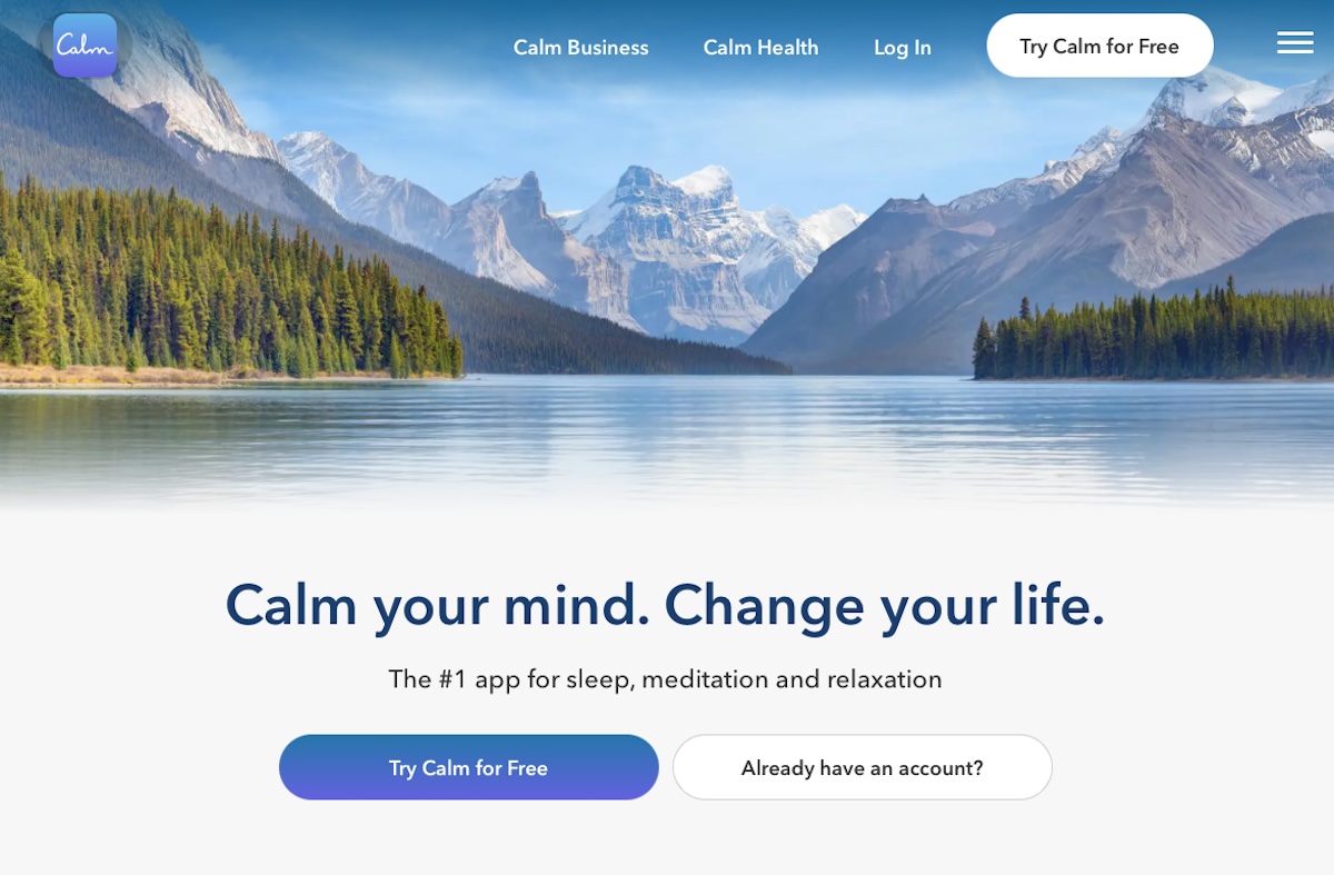
Be sure to use large, bold fonts to make your message stand out, and complement this with high-resolution images or background videos. The Calm app, for instance, uses ample white space and clear, compelling visuals to draw people in.
The image selected radiates a sense of calm — exactly what you’d hope to experience with the product at hand.
2. State a clear value proposition
Your value proposition should succinctly explain how your product or service solves customers’ problems. Or it might show how it improves their situation or delivers specific benefits. No matter your approach, it should tell your ideal customer why they should buy from you and not from the competition. And it shouldn’t take an entire paragraph to accomplish this mission.
An effective value proposition is a pretty important cornerstone for your entire marketing program — not just your landing pages. So if you don’t already have a permanent value proposition established for your company, you’ll want to spend some extra time with this step. Here are some extra tips to make the most of your efforts:
Be specific and focus on tangible benefits
Steer clear of vague statements and industry jargon. Instead, talk about specific outcomes customers can expect and benefits you offer. So, instead of saying “Improve your productivity,” specify how and by how much. Something like, “Reduce unnecessary meetings to boost your team’s productivity by 40% in just one month”, is a much clearer value proposition.
Address your ideal customer’s pain points
Understand your customers’ challenges and explain how your product or service addresses these issues. Conducting customer research and gathering feedback can help you pinpoint these needs and incorporate them into your landing page copy.
Emphasize what sets you apart
This could be unique features, superior quality, exceptional customer service, or some new technology. Take P2 as an example. They keep their homepage or landing page simple, with a headline visible immediately. As of 2024, it includes, “A platform for teams to share, discuss, and collaborate openly, without interruption.”
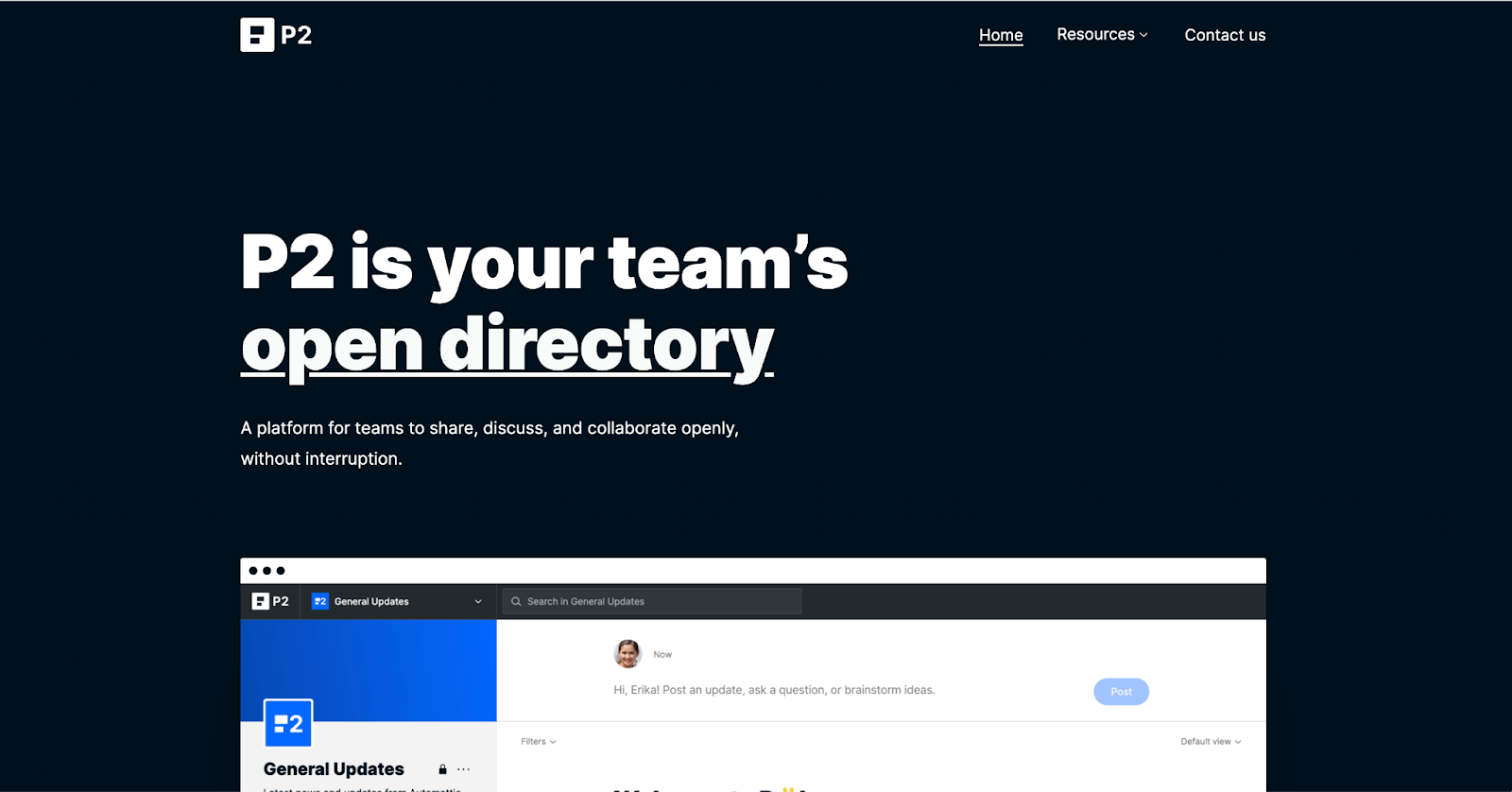
And a quick scroll makes it abundantly clear that the value proposition here is a streamlined team communication and work reporting platform.
3. Write compelling headlines
A compelling headline is critical for capturing your audience’s attention and encouraging them to read further. It’s the first thing visitors notice, and it sets the tone for the rest of your landing page.
To create headlines that convert, you need to ensure they immediately convey what your product or service is and the primary benefit it offers. Avoid ambiguous or clever phrases that might confuse visitors. Clear and direct headlines ensure that visitors understand the core message at a glance. For instance, Grammarly features a few headlines on its landing page, including, “Better writing, better results.”
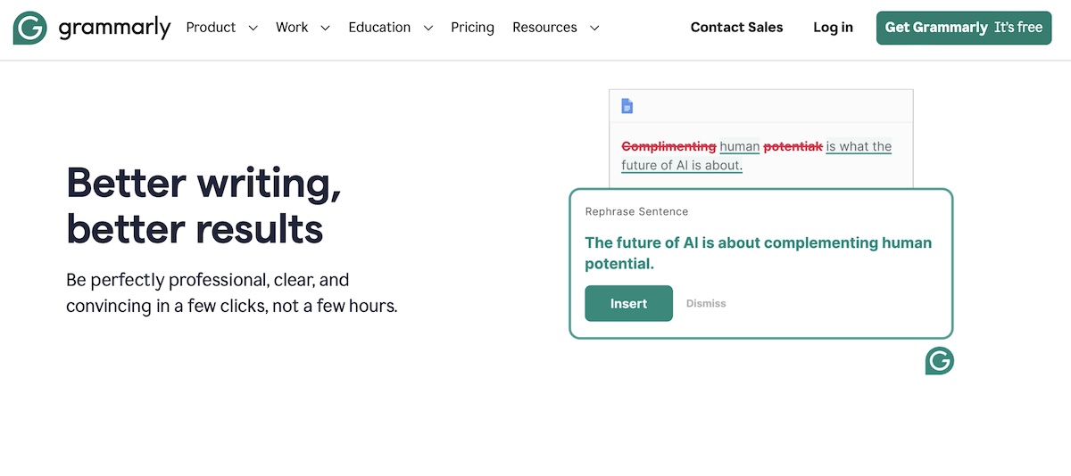
Both of these headlines make it clear what customers stand to gain from using this service.
Beyond the benefit-focus, you can also follow a couple of tried and true rules for writing compelling headlines. For instance, you can use powerful words that evoke emotion and encourage action, like “Transform” or “Discover”.
Including numbers or specific data in your headline can make it more credible, too. Statistics, percentages, and specific figures attract more attention than generic statements.
4. Use visuals
Visual elements matter a great deal, too. They help to break up text, illustrate key points, and keep visitors interested. So it’s obviously worthwhile to include only high-quality images on your landing page.
Doing so will make it look more professional. Any old image won’t do, however. Make sure the visuals you select are relevant to your content. For example, lifestyle images that depict people using your product in real-life scenarios can create an emotional connection with visitors.
You could make use of background videos, too. These add a dynamic element to your hero section, making it more engaging. They should be short, relevant, and high-quality — of course — and feed into the overall visual narrative of your landing page.
A strategically-placed infographic is a nice touch, too. These images make it straightforward to display complex information in an accessible way. They can help explain processes, display statistics, and illustrate the benefits of your product.
5. Keep forms short and simple
No one wants to have to spend several minutes completing a complex form. That’s why keeping yours short and simple can help boost the conversion rate on your landing page. This won’t necessarily apply to every industry, where some might need to capture a great deal of information to do business together properly.
For most, however, keeping the number of fields on your forms limited is a wise choice. Try to keep it all on one screen, too. Multistep forms can be effective in fields where you have complex data collection needs, but a straightforward 3-4 field form is still typically best.
Ensure that each form field has a clear, concise label that indicates what information is required, and make use of inline validation. This provides real-time feedback to people as they fill out the form.
This feature helps users correct errors immediately and increases the likelihood of form completion.
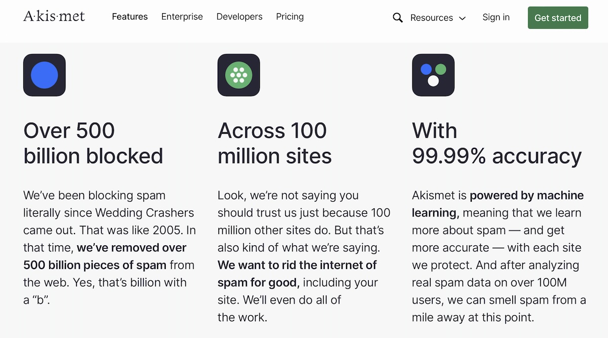
The Akismet enterprise contact page offers a solid example of an effective landing page contact form.
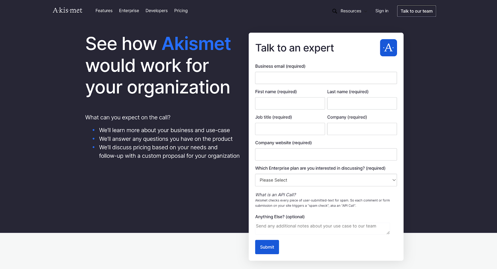
It asks for straightforward, relevant information without being overwhelming. There’s just enough questions to segment submissions without plummeting conversion rates.
6. Avoid using CAPTCHA
CAPTCHAs are commonly used to prevent spam and bot submissions on forms, but they can also create friction and frustration for genuine users. Any added friction in the conversion process can lead to an increased bounce rate. So, skipping the CAPTCHA on your landing page forms is the best approach.
Beyond the UX inconvenience they pose, CAPTCHAs also present accessibility issues and can be quite problematic for those with disabilities. Visually impaired people may find it challenging to complete visual CAPTCHAs, while audio CAPTCHAs may not be effective in noisy environments or for those with hearing impairments. A less accessible, inclusive website can make for a knock to your brand’s reputation, a lack of compliance with accessibility standards, and reduced conversion rates.
All that said, you still don’t want to be inundated with spam. Thankfully, there’s a better way to prevent this kind of annoyance.
Instead of relying on CAPTCHAs, using Akismet is an effective, cost-efficient solution. Akismet’s powerful spam filtering service can automatically detect and block spam submissions without requiring any user interaction.
Used on over 100 million sites, Akismet works continuously in the background without slowing down your site, and it boasts a 99.99% accuracy rate.
7. Focus on benefits
Though mentioned in passing in a few of the points previously, prioritizing benefits warrants its own item on this list. It can’t be overstated how important focusing on benefits of your product or service is — especially in contrast to just listing features.
Benefits explain how the features improve your customer’s life, solve their problems, or fulfill their needs. A list of features doesn’t do any of this, as it doesn’t offer the “why”. A benefits-focus, however, is compelling and relatable.
If you’re stumped on where to begin with this, try translating each of your product or service’s features into a clear, user-centric benefit.
For example, instead of just stating “Our software has automated reporting”, you might say, “Save hours of manual work every week with our software’s automated reporting. This allows you to focus on the big picture”.
Emphasize your unique selling points, too. They should be framed as benefits that set your product apart from the competition. Why is your product the best choice?
For instance, if you sell solar panels, you might say, “Our solar panels are designed to withstand extreme weather conditions, providing reliable energy production year-round.
8. Include video testimonials
You can boost landing page conversion rates by incorporating video testimonials into your content as well. These videos act as social proof by showcasing real customers who have benefited from your product or service. When your claims can be backed up by real customers’ words, your USPs become much more convincing.
You’ll need to use real customers in your video testimonials to provide authenticity and relatability. Genuine experiences from actual users are much more convincing than scripted or generic endorsements.
Encourage those who provide testimonials to be specific and results-oriented in their commentary. Did your product make their workflow more efficient? Did they save money? Be sure the benefits and outcomes are emphasized.
While the content of the testimonial is most important, good production quality can enhance the credibility and professionalism of the video as well. Good lighting, clear audio, and a stable camera setup never hurts.
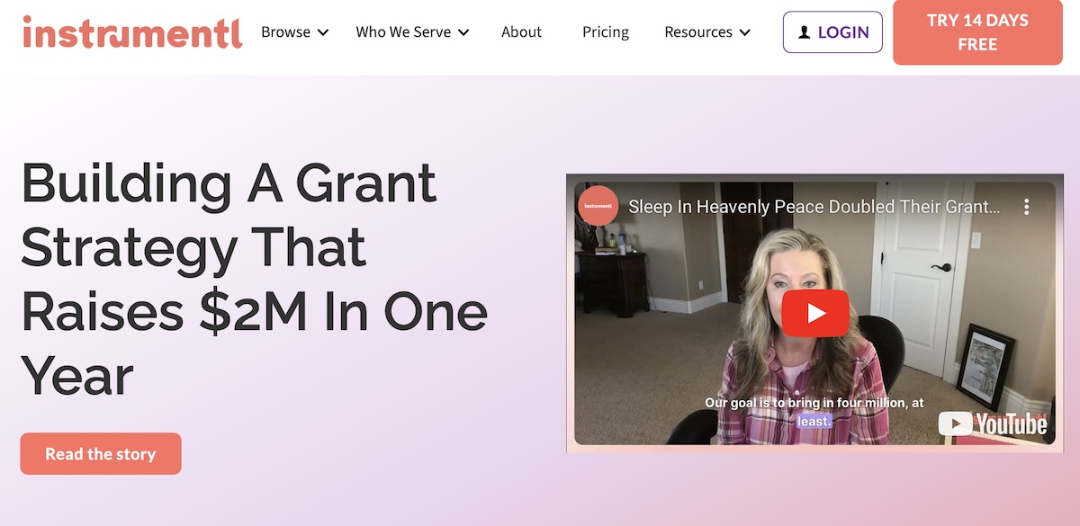
Instrumentl, a grant finding tool and non-profit, has a dedicated customer stories landing page with video testimonials prominently displayed.
9. Highlight social proof to build credibility
Video testimonials are an example of social proof, but there’s more to it than just that. Social proof offers a direct way to boost your landing page’s credibility and encourage conversions. It makes use of the influence of others to validate your product or service. This makes potential customers more likely to trust your brand because they’re hearing from past customers.
Customer testimonials provide first-hand accounts of users’ positive experiences with your company. Featuring quotes — written or video — can go a long way to encourage the sale.
In-depth case studies are another solid approach here. You can use them to showcase detailed examples of how your product or service has solved specific problems. These narratives often include before-and-after scenarios to demonstrate measurable results and concrete benefits.
10. Use trust signals
Trust signals are little design elements or phrases you can add to your landing page that reassure visitors about the credibility and safety of your business.
You can show trust badges and certifications from reputable organizations to further reassure site visitors of your credibility. Things like industry awards and memberships apply here, as do things like a badge stating you’re a BBB Accredited Business.
Security badges from reputable organizations indicate that your website is safe and secure for transactions, too. Common examples include SSL certificates and TrustedSite. Displaying these badges near forms and payment sections can add that bit of extra reassurance customers need to convert.
Other trust signals relate to how you do business. Offering a money-back guarantee can significantly reduce the perceived risk of purchasing your product or service. The same goes for posting clear and fair return and refund policies. Putting these in an accessible location indicates your company is customer-centric and willing to address any issues that arise post-purchase.
Displaying user reviews and ratings from third-party sites such as Google, Yelp, or industry-specific review platforms can add a layer of authenticity and trust, too.
You can also display client and partner logos on your landing page to serve as quick endorsements.
Lastly, providing clear and accessible contact information, such as a phone number, email address, and physical address, can increase trust, too.
Culture Amp offers a solid example of many of these trust signals in action. They pack in many of them above-the-fold.

You can see past client logos, contact information, and ratings on reviews sites at a glance here.
11. Anticipate and address common objections
Having a clear idea of where your potential customers are coming from and doing your best to mitigate their concerns can go a long way.
To begin, you’ll need to identify the most common objections your potential customers might have. This could include concerns about price, product effectiveness, ease of use, customer support, and return policies. You can reach out to people on social media to ask about their concerns directly to gather this information.
Then, you can create an FAQ section to answer the most common objections. That way, when a prospect lands on your site, they’ll have their questions answered without having to contact you. The less effort a potential customer has to put in to come to a purchasing decision, the better.
Providing clear pricing can help, too. There’s nothing worse for a customer than arriving at the checkout screen to realize hidden fees have been added to the purchase price.
12. Use clear calls to action (CTA)
A clear and compelling call-to-action is your landing page’s make-or-break moment. It’s the last bit people see before they decide to convert (or not).
To make the most of your final push to encourage prospects to become customers, be sure to use strong, action-oriented verbs that clearly tell visitors what they need to do. Phrases like “Get Started”, “Download Now”, “Sign Up Today”, and “Claim Your Free Trial” are direct and encourage immediate action.
You can also incorporate a sense of urgency into your CTA to prompt visitors to act quickly. Phrases such as “Limited Time Offer”, “Only a Few Left”, or “Register Before It’s Too Late” can create a sense of scarcity and encourage immediate action.
Any CTA you present should stand out visually on the page. Use a contrasting color that draws attention and ensures the button doesn’t blend in with the rest of the content. Make it stand out.
And don’t be afraid to include supporting text around your CTA as well. Such text provides additional context and reassurance. For example, adding a short phrase like “No credit card required” or “Free for the first 30 days” can alleviate concerns and make the offer more enticing.
Dropbox offers a to-the-point CTA that’s upfront and hard to ignore.

The “Find your plan” button sounds non-committal but ultimately a great way to entice people to sign up.
13. Incorporate directional cues
Any visual element that guides a site visitor’s attention to critical parts of your landing page could be considered a directional cue. Often, you’ll find them pointing to key page elements like the CTA or a contact form.
Arrows are one of the most straightforward and effective directional cues. And by having them point to your CTA, you’re drawing the visitor’s eye to it and making it clear that’s where they should click next.
Similarly, lines or pathways can subtly guide the user’s gaze through the page as well. You want to lead them on a journey that ends with interacting with your CTA.
But arrows and lines aren’t the only directional cues you can use. Images of people qualify as well. Photos where the subject within is looking in the direction of your CTA is an effective choice, too. For instance, a photograph of a person looking toward a “Sign Up” button can direct people’s attention to that area.
14. Harness urgency and scarcity
Another way to boost landing page conversion rates is by compelling visitors to act quickly. These psychological triggers leverage the fear of missing out (FOMO), which can be a powerful motivator.
You can activate FOMO by making deals available for only a limited time. When a discount or promotion is available for a short period, people may be more likely to act immediately and complete the purchase. You can clearly display the time limit with countdown timers to make the deadline visible and tangible.
Amazon does a good job of this, with their red “Limited time deal” flags on products available at a temporary discount.

Including low stock notices on product pages leans into this sense of scarcity as well. Or, you could offer an exclusive deal to a subgroup of your customer base — like email subscribers.
You can further add to this sense of urgency and scarcity by adding real-time notifications to your site. These notifications will let customers know how many people are viewing a particular item — or how many of an item is still in stock.
15. Practice risk reversal
Risk reversal plays into the trust signals discussed previously, but it warrants its own callout here. This tactic involves offering guarantees or assurances that reduce the perceived risk for potential customers.
The best example of risk reversal in action is offering a money-back guarantee. This offer assures customers that if they are not satisfied with the product or service, they can get a full refund. And when implemented clearly and well, this can reduce purchase hesitation. State the terms of this guarantee upfront and prominently, such as “30-day money-back guarantee” or “Satisfaction guaranteed or your money back”.
The same goes for free trials. This offer lets customers try your product or service before committing to a purchase. This is usually a great choice for software products, subscription services, and digital products. To promote this, you might say, “14-day free trial with no credit card required.”
Along with a money-back guarantee and a free trial, you could also provide a hassle-free return and exchange policy as well as warranties, when applicable.
Warby Parker has an impressive free trial offer — you can test out five different eye-glasses frames at home without spending a penny.
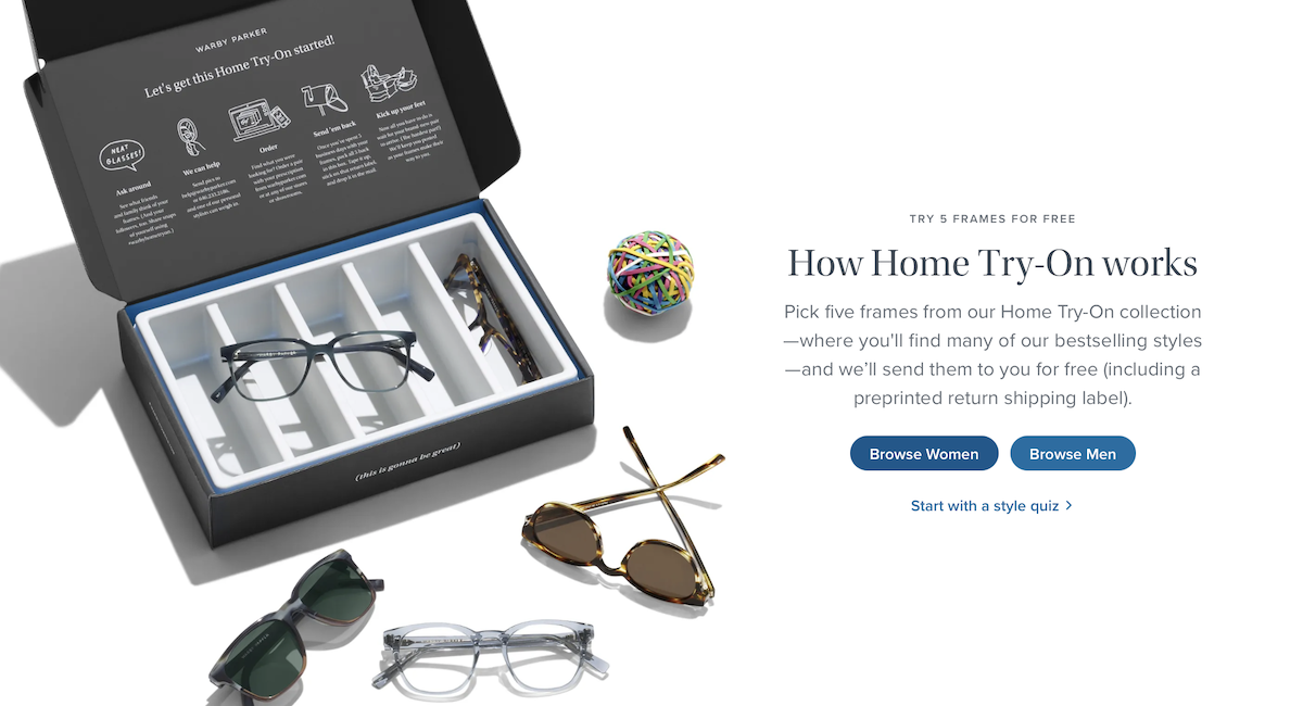
This offer is mentioned above the fold on the homepage, making it tempting to new customers.
16. Make sure your pages are responsive and mobile optimized
It might sound like a small thing, as it’s an expected part of web design nowadays, but ensuring your landing page is responsive and mobile-optimized is a must, too. Offering a seamless mobile experience for prospective customers improves UX and engagement, which means more conversions for you.
On mobile devices, your site should prioritize a clean and straightforward menu structure that’s accessible. A common approach is the “hamburger” menu, which expands when tapped. Ensure that key elements like your CTA are prominently displayed and easily accessible without requiring excessive scrolling, too.
Keep links touch-friendly, too. And before you launch your landing page, be sure to test it across multiple devices and screen sizes.
17. Ensure your site loads quickly
Paying attention to loading speeds can help keep your landing page conversion-ready. Pages that are too slow to load can cause visitors to get frustrated and bounce.
Knowing this, following best practices for improving site speed is imperative. You’ll want to pay attention to things like compressing images, making use of browser caching, and minimizing HTTP requests. You’ll also need to minify your code and use a CDN to reduce overall latency at the server level. Tools like Google PageSpeed Insights can help you identify and address issues.
18. Consider color psychology
Another way you can improve your landing page conversion rate is by using color psychology. This is a time-honored approach in marketing that can help you effectively influence visitors’ emotions and actions.
According to Oberlo, here are some colors and their typical psychological associations. This information could help you get a handle on how your color choices can influence the ways customers feel (and act):
- Red creates urgency and excitement. It’s a good color for CTA buttons and limited-time offers.
- Blue conveys trust and calmness. This is great for finance, healthcare, and technology brands.
- Green is associated with growth and harmony. Green is suitable for environmental products and health brands.
- Yellow makes people feel optimistic. It’s effective as an accent color to highlight important information.
- Orange conveys a sense of confidence. This is good for CTA buttons and banners.
- Purple represents luxury and creativity. Purple is ideal for high-end and innovative products.
- Black conveys sophistication. Black is often used for luxury brands as well.
- White symbolizes simplicity. It’s great for backgrounds to create space and clarity.
You’ll want to make use of contrasting colors to make important elements like CTA buttons stand out as well.
19. Offer comparisons
If you are confident in your product or service’s ability to outperform the competition, offering direct comparisons can be a solid selling point. And in doing so, you can highlight your unique advantages and convince potential customers to choose you.
While you can simply write up comparisons as body copy, a comparison table can be helpful for those skimming through your landing page for pertinent information. In it, you’ll want to list features, pricing, benefits, and other relevant factors side by side to make it simple for visitors to see where you excel. Ensure that the table is clear, concise, and legible, too.
Be honest in your comparisons, however. Highlighting your strengths is essential, but avoid misrepresenting or downplaying competitors if your statements are false.
20. Promote lead magnets
Offering a lead magnet is another great way to attract attention and convert prospects into customers. Lead magnets are valuable resources offered for free to visitors in exchange for their contact information, typically an email address.
Offering any old piece of content for free won’t do, however. A successful lead magnet addresses a specific problem or offers a solution that your audience finds valuable. So long as it achieves this goal, the type of content you offer could be pretty much anything. Popular types of lead magnets include things like eBooks, checklists, access to webinars or workshops, templates, or even free samples.

WordPress VIP, in exchange for filling out a simple form, offers a 2024 report on how content drives growth. This is a great lead magnet, as it’s directly applicable to the types of enterprise businesses that might use their services.
21. Be consistent in design and message
No matter your industry, presenting a consistent design and message is another key component for successful landing pages. A clear and consistent brand conveys trust helps with recall..
It’s convenient to say “be consistent” but the truth is, you need to approach the design and message with a clear plan — from the start. That means developing comprehensive brand guidelines that outline your brand’s visual and verbal identity.
These guidelines should include things like how and when your logo should be used (including size, spacing, and color variations), your site’s color palette, the typography used, the types of images (illustrations or photos), and the tone of voice of your content. Once you have these guidelines in place, you can make sure your content adheres to them.
Stripe does a good job of this on its website.

It prioritizes purple and blue colors, dynamic animations, and a confident voice.
22. Make accessibility a priority
You’ll also want to ensure your landing page is accessible to people with disabilities. This isn’t just a legal requirement, but also an essential part of reaching everyone with an optimal user experience.
There are a few ways to ensure accessibility, including the use of semantic HTML, which provides meaningful markup that helps screen readers and other assistive technologies understand the structure of your content.
You’ll also need to provide text alternatives for images, videos, and audio files. Use alt attributes for images to describe their content. For complex images like charts, provide a detailed description in the surrounding text. And transcribing video and audio content (and offering closed captions for videos) goes a long way, too.
Following the Web Content Accessibility Guidelines is your best bet for making sure you cover all aspects of web accessibility, from ARIA landmarks to keyboard accessibility
23. Offer live chat for personalized assistance
One way to really make your landing page stand out is to offer live chat. Providing real-time, personalized assistance makes it so you’re addressing customer questions the moment they arise. You can resolve issues and guide visitors through the decision-making process immediately. When you provide timely help like this, you’ll boost conversions.
You can also use proactive chat invitations to engage visitors who may need assistance but haven’t initiated a chat yet. For example, if someone spends a decent chunk of time on a product page or is about to exit, a chat popup can appear asking if they need help.
For instance, if you have a WordPress site, a WooCommerce extension like LiveChat for WooCommerce can help you field customer questions in real time in a way that’s integrated with your broader store.
24. A/B test
The last recommended tactic for improving your landing page conversion rate is to A/B test everything. Split testing involves comparing two versions of your landing page, each with a single element slightly different, to determine which one performs better.
Common elements to prioritize in A/B testing include headlines, CTA buttons, image choices, color schemes, copy, and layout variations.
With your element selected, you can then create two or more variations of the element you want to test. For instance, if you are testing headlines, write multiple versions that highlight different benefits or use different tones. Then, compare them over a set period of time. The one that encourages a better conversion rate is the winner. Then you can move on to test a different element.
To run a test like this, you’ll need to split your website traffic. There are tons of tools out there to facilitate this, including Optimizely.
Frequently asked questions
Now that we’ve explored multiple ways to optimize your landing pages and improve their conversion rates, take some time to browse through some frequently asked questions about this process.
What are the common mistakes to avoid when designing a landing page?
Common mistakes to avoid when designing a landing page include a cluttered design, an unclear CTA, slow loading times, a lack of mobile optimization, and not addressing visitor pain points. You’ll need to speak directly to your target audience and provide an accessible and user-friendly on-site experience to see improved conversion rates.
What is a good conversion rate for a landing page?
A good conversion rate varies by industry. But for landing pages in general, a good conversion rate is 2-5%. However, top-performing landing pages can achieve conversion rates of 10% or higher, especially if the industry is very specific.
Should I use CAPTCHA to protect my form from spam?
While CAPTCHA can prevent spam, it can also deter genuine site visitors from converting. So, no, you shouldn’t use CAPTCHA and should opt for an alternative like Akismet. This anti-spam alternative to CAPTCHA offers effective spam protection without compromising the user experience.
What is Akismet, and how can it improve my lead generation form conversion rate?
Akismet is a powerful spam-filtering service that automatically detects and blocks spam submissions. And it doesn’t rely on CAPTCHA to do it. This means users have fewer steps to complete forms, thus improving conversion rates without leading to an increase in spam.
What types of companies generally use Akismet?
Akismet is trusted by over 100 million sites, including enterprise brands like Microsoft, ConvertKit, and Bluehost. Akismet provides effective spam protection that doesn’t impede on lead generation efforts, offering a win-win scenario for companies of all sizes.
How often should I update or tweak my landing page for optimal performance?
You should update or tweak your landing page on a regular basis. Aim to review and make changes to your landing page at least quarterly, or more frequently if you notice a drop in performance metrics or significant changes in user behavior. Keeping an eye on metrics and conducting regular A/B tests can help mitigate sudden increases in bounce rate.
What is a lead magnet, and how can it boost my landing page conversions?
A lead magnet is a valuable resource offered for free in exchange for contact information. Popular types of lead magnets include eBooks, checklists, and reports. The most effective lead magnets attract and convert visitors by providing immediate value. This then inserts the prospect into your sales funnel, which means they’re primed and ready to make a purchase later.
What are the key metrics to track when analyzing landing page performance?
When tracking and analyzing landing page performance, you should keep an eye on its conversion rate, bounce rate, average time on page, click-through rate (CTR), and cost per conversion. Tracking these metrics helps identify areas for improvement and measure the effectiveness of the optimizations you make.
What are some common mistakes to avoid when optimizing a landing page?
When optimizing a landing page, you’ll want to avoid common mistakes like making too many changes at once, which makes it impossible to see how individual changes are affecting performance.
Another mistake is ignoring mobile visitors. Any landing page created in 2024 should be optimized for mobile interaction by default. Also, not aligning the page with user intent or addressing customer pain points are big issues.
